
Welcome back to Room Reno #62 here at The Sims Resource! Today we’re helping a couple who wants to transform their very strange and empty living room into a modern lounge space for them and their guests. Let’s meet them!
Meet Stella and George!

Stella and George recently bought their forever home in Windenburg! They love the property, but the house definitely has a bunch of weird quirks. The one that really needs to go first is the strange living room that they currently have. It’s in a weird spot in the layout, but the couple doesn’t quite have the money to start knocking down walls, so we’re going to have to work with what they have. The real issue with this living room is how…colorful it is. As in, it’s one color. And the color is not good. Keep reading to see exactly what the issue is with this very strange paint job…
The Before

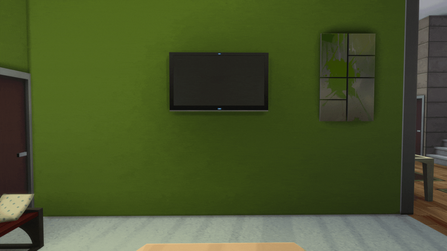
So this room is very…green. For no reason at all, really. I have no idea what could have motivated someone to pick this wall color, but it really shouldn’t be used for every single wall in a room–and definitely not on walls this tall! It makes the space feel claustrophobic and overwhelming even though green is usually considered a soothing and natural color. I considered changing the shade of green to a mint or an emerald to try and change the emotional impact, but I really found that I wanted away from green altogether when I was building this space (there was just so much!).
The room layout is confusing at best, if I’m being honest. The way that everything is positioned makes the area feel like a hallway more than a place to actually sit and spend time with people. The biggest couch isn’t facing the TV, which is really weird in a room that has a big, wall mounted TV to begin with. The super modern couch with the more old-fashioned furniture is certainly eclectic, but not in a cute way. In order to make this room work (and also match the rest of the house), everything is going to have to work with one cohesive theme instead of the hodge podge it currently is. Hodge podge can definitely work–but since the owners want a modern room, it’s all gotta go.
The Planning

The planning of this space was pretty easy, since the room had a pretty workable layout before. The door really posed the biggest issue. It’s not the front door of the home, but a side door, which means that I could have just gotten rid of it altogether, but I thought leaving it for playability was a better move (and more of a building challenge) so I decided to keep it. The challenge with the door is that it could make the living room feel more like a passing-through space instead of a relaxing one, but I think this layout solves that problem pretty well.
I wasn’t sure if I wanted to have two chairs to go with the couch, or just one. Having more seating for guests is always helpful, and extra chairs means more opportunities to incorporate color or accent tables to the space. Ultimately, I decided that more chairs would make the room feel a little cluttered, so I went with just one (large) chair. If I were to do this room in a different style, I would probably have done more than one, but the modern/minimalist look really depends on a certain degree of sparseness so I’m happy with what I chose to do here.
The After

This finished room is lean, mean, modern machine! I’ve talked in the past about how modern and minimalist designs are hard for me – I just naturally want to add clutter and color and suddenly the room isn’t modern or minimalist at all. Because of that, I’m really happy with how this room turned out, as simple as it is. It took a lot of restraint on my part–you should have seen how many clutter objects I went through to make that bookshelf look aesthetically barren while also filling it with objects so it wasn’t completely empty. Is this a problem that only I could have? Probably. But I’m still proud that I figured it out!
The yellow couch is absolutely my favorite part of the room. I wanted a big, bright focal piece to center the room around. The yellow couch does that without being too overwhelming and actually ties into the house’s floors, oddly enough. The yellow also contrasts nicely with both white and black, the other two main colors in the room, so it was a natural choice when it came to picking out the shade. I think my pop of color turned out well, and I’m excited to try it with more builds in the future!
The windows and wall height were probably my biggest challenges (outside of the style) in this build. If you’ve ever read a Room Reno before, you’ll know that I really hate building with the tall wall height–it makes the walls really hard to fill up and make look good without having to scale up all the art pieces you have. This isn’t helped by how many art pieces don’t scale well or glitch out when you make them bigger! The tall windows helped to hide some of the excess height, and I made sure to use a tall fireplace and large paintings to help the other wall. I think it helped the space feel more complete. Modern builds definitely benefit from more wall height, though I would probably go with the medium height if I were building from scratch (just to make my life easier).
Thanks for checking out Room Reno #62: Modern Living Room! If you liked this blog, check out Room Reno #61: Cozy Master Bedroom or a one-color CAS challenge. Looking for something else? Read an update on all the newest game news or about the latest game patch! Have a great day 😎