
Announcements
The Sims 4 June Update Finally Cuts Down on Phone Call Spam
Sul sul, Simmers! Today, Electronic Arts released the Laundry List for the upcoming June 30th update! This update will fix over 10 of ...

News
EA Buyout Update – “The Funeral for Gaming”
On June 13th, gamers protested with a funeral and mourning outside EA’s Orlando office. This protest was to voice their concerns about the ...
Gameplay
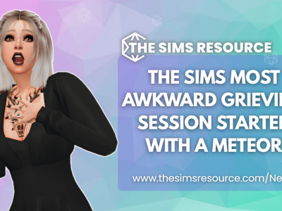
The Sims’ Most Awkward Grieving Session Started With a Meteor
When tragedy strikes in The Sims 4, it often leads to unexpected hilarity, though, depending on your perspective, it can be seen as ...
Gameplay
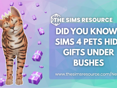
Did You Know? Sims 4 Pets Hide Gifts Under Bushes
If you enjoy playing with pets in The Sims 4, this article is just for you! Pets in the game have a knack ...

Humor
This Sims 4 Dinner Invitation Came With Nine Urns
When you receive an invitation to a dinner party, you probably don’t expect to be welcomed by nine urns. If you find yourself ...

Humor
The Sims Grim Reaper Picked the Creepiest Way to Visit a Lot
We all know that Grim can be a bit of a creep! It’s not entirely his fault. When you harvest souls for a ...

Humor
The Sims Player Gets Father Winter Abducted Twice in One Night
When Father Winter overstays his welcome during Winterfest, what do you do? Do you let him stay? Or do you kick him off ...

News
The Sims 4 Gardening Tips Cover Rare Plants, Seasons, and Magical Gnomes
EA has recently shared a gardening refresher for The Sims 4, focusing on plant care, rare harvest, and various gnome-related mechanics. The ...
Humor
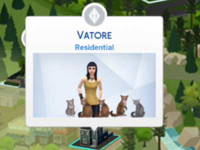
The Sims 4 Neighborhood Stories Turns Lilith Vatore Into a Cat Mom
Neighborhood Stories strikes again. Another household has been torn apart, and this one is stranger than before. First, Lilith had 7 babies in ...

Humor
The Sims 4 Vampire-Werewolf Hybrid Breaks the Needs Panel
Sometimes things that shouldn’t be possible in The Sims 4 still happen. Hybrids, for instance, technically aren’t meant to exist, but the game ...